“Pixel Perfect”. The Holy Grail. The Dream. The ability to take an asset designed in Photoshop, Sketch, Figma and implement in code is the superpower of frontend developers. Browsers are weird. Design tools are weird. Our eyes are weird. “Pixel Perfect” is hard. The legacy of “Pixel Perfect” is a million little JIRA tickets titled “Change 3px to 2px.” Death by a thousand paper cuts. The reality is we’re often only Pixel Pretty Close.
When you’re developing Design Systems, every pixel has its purpose. Being off by one can break layouts, applications, and hearts. So how does one validate pixel-perfection without screeching productivity to a halt to examine every commit under a magnifying glass?
While developing Astro UXDS, we wanted a fast method for checking our components in code against their Figma counterparts. This want quickly became a need when we undertook a massive effort to implement spacing design tokens. Our solution is Figma Testing Library.
Figma Testing Library is a lightweight Web Component that pulls in your designs from Figma and overlays them right on top of your code. Because it’s a Web Component, it can be dropped into any dev environment—plain ol’ HTML, React, Angular, Vue with only a few lines of code. It uses the Figma REST API to pull in any layer you want from Figma.
The Manual Way
One method to validate that your code is 100% pixel-perfect to your design is to use the overlay method, as described by David Luhr in Behind the scenes of creating the official Figma kit for Tailwind UI. The process involves:
- Opening up Dev Tools
- Selecting your component element
- Right click -> Capture Node Screenshoot
- Grabbing the screenshot and importing over your Figma component
- Aligning the screenshot and toggling the opacity.
This process works great, but it has two major issues.
- It’s incredibly time-consuming.
Imagine having to do this for every component in your library, including every variant and every state. It can quickly get out of hand. This process works great for full comps, but not so great for individual components.
- It assumes code is the source of truth.
This all depends on your use case. The overlay method works great if your source of truth is code and you’re trying to recreate it within Figma. But if your source of truth is Figma and you’re trying to recreate it in code, you’ll find yourself having to capturing screenshots over and over as you iterate over that last begrudging 1px difference.
A (somewhat) better way
Instead of overlaying code screenshots in Figma, what about overlaying Figma screenshots in code? You can easily export any layer from Figma to png. You could take that png, import it into your project, and position it on top of your code. Instead of manually exporting from Figma, you could use the Figma REST API to automatically pull in the latest version of a component. Next, you might find yourself wanting to switch between code and Figma quickly or control the level of opacity on the overlay.
Figma Testing Library is a collection of two Web Components that do exactly that for you.
Getting Started
In your project, open up your index.html and plop this import in:
<script type="module" src="https://unpkg.com/@rocketmark/figma-testing-library/dist/figma-testing-library/figma-testing-library.esm.js"></script>
This will import and register the Figma Testing Library web components straight from a CDN.
Setup the holster
The <ftl-holster> component wraps around your application code, overlays your Figma image, and provides a few useful UI controls.
Let’s say you have a button component you want to test:
<my-button variant="outline">My button</my-button>
Simply wrap your component in a <ftl-holster>
<ftl-holster>
  <my-button variant="outline">My button</my-button>
</ftl-holster>
Next, you’ll need to supply the holster with a few pieces of data:
FULL DISCLAIMER: This component needs a Figma access token to use the REST API. Think twice before blindly pasting your access token into someone else’s code. Review the source on Github. Review the code from the CDN. This tool should only be used locally.
- A Figma Access Token
- Login to your Figma account.
- Head to the account settings from the top-left menu inside Figma.
- Find the personal access tokens section.
- Click Create new token.
- A token will be generated. This will be your only chance to copy the token, so make sure you keep a copy of this in a secure place.
- Your Figma file ID
- You can find your Figma file’s ID by inspecting the URL:
https://www.figma.com/file/<MY FILE ID>/my-file
- You can find your Figma file’s ID by inspecting the URL:
- The Node ID of the Figma layer you want to overlay.
Now I admit this process is less than ideal and future revisions may improve the DX.
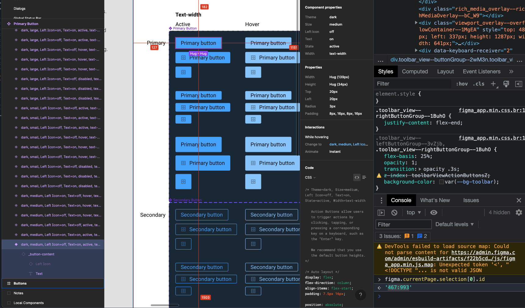
Every Figma layer has it’s own unique node id. You can find the node id for any given layer simply by using Figma in the browser and opening up Dev Tools. In the console, you have full access to the Figma’s Plugin API using the figma object. (So cool). To find the node id, select a layer and enter:
figma.currentPage.selection[0].id
You’ll get something back that looks like “467:993”.
Node IDs rarely change so you should only need to go through this process once. You can also copy a Figma file to a local draft and it will retain the same node IDs.
Pass that data into the ftl-holster component:
<ftl-holster
	access-token="MYSECRETACCESSTOKEN"
	file-id="MYFILEID"
	node="123:456"
 >
  <my-button variant="outline">My button</my-button>
</ftl-holster>
Open up your browser and you should see your holster in all its glory
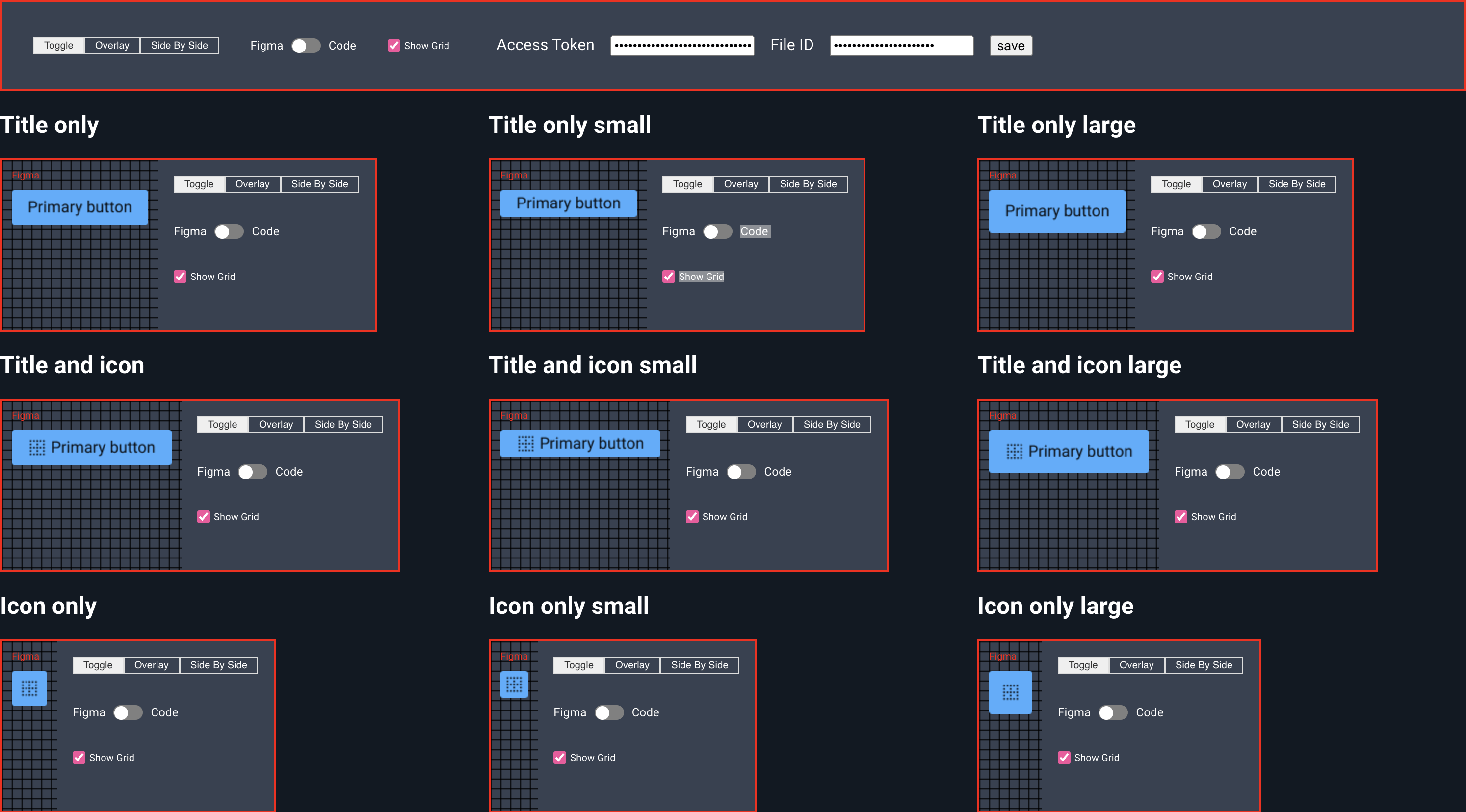
The holster has three modes: Toggle, Overlay and Side By Side.
Toggle Mode
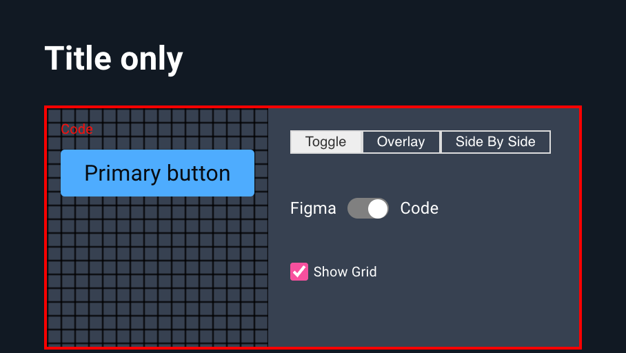
Toggle Mode exposes a single switch to quickly swap between the Figma component and the code component. In Toggle Mode, you can use your browser’s dev tools as you normally would to make those problematic 1px adjustments in real time.
Overlay
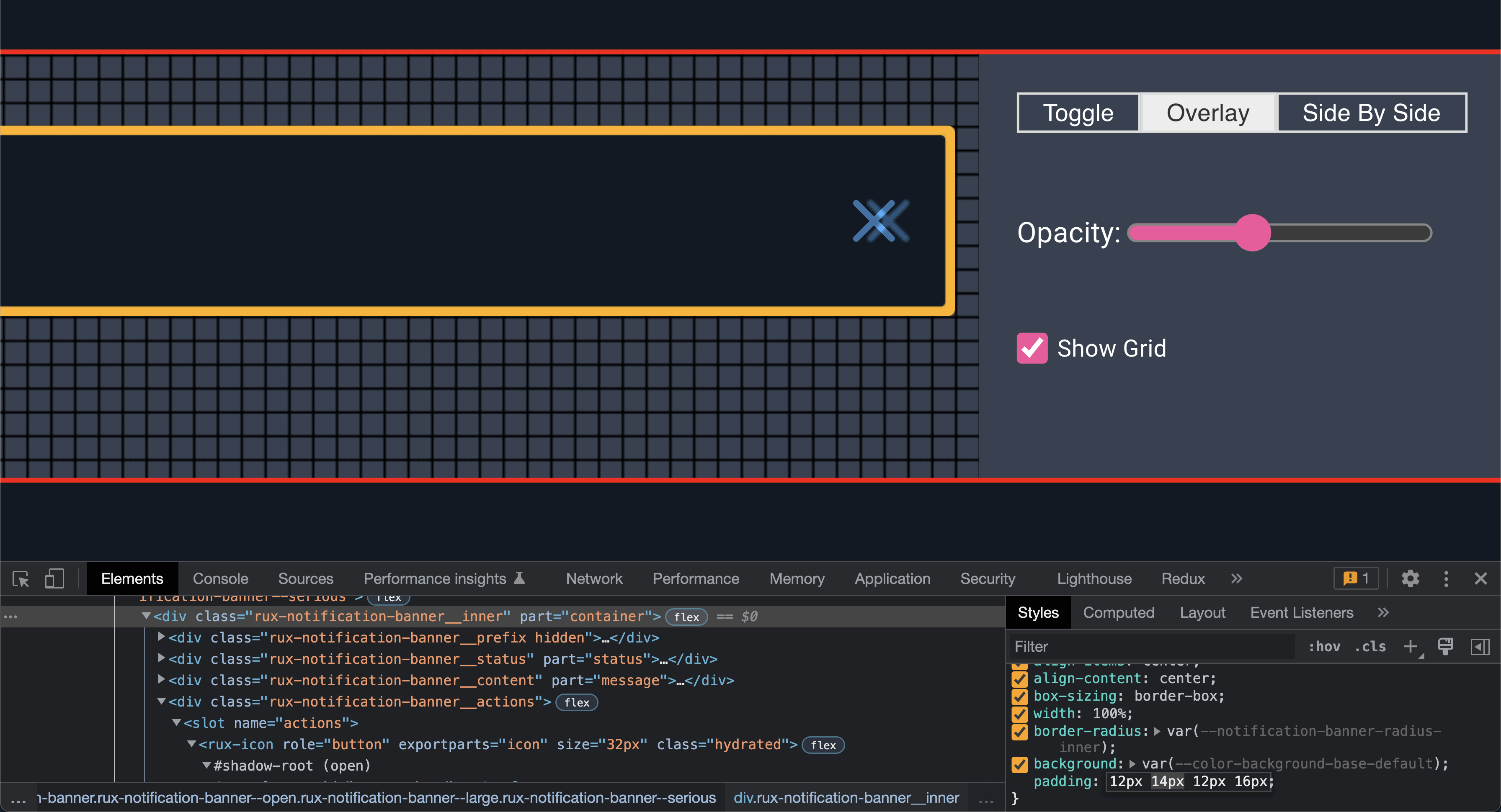
Overlay Mode positions the Figma component on top of your code component. It has a range input to control to the level of opacity.
Side By Side
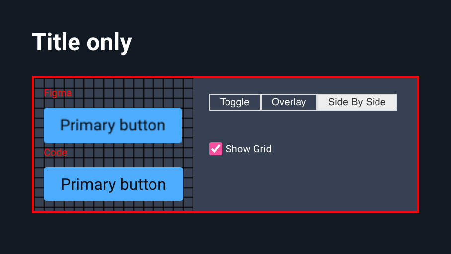
Side By Side Mode will show you both Figma and Code at the same time.
Many Holsters, Handle It
Naturally you might want to test many components at once. You can use the optional <ftl-belt> component to control all of your holsters from a single location. <ftl-belt> also exposes input fields for your access token and file id in your UI so you don’t have to add them manually to every holster or accidentally commit them in your repository.
When an <ftl-belt> is used, the access-token and file-id properties on <ftl-holster> become optional.
<ftl-belt access-token="MYACCESSTOKEN" file-id="MYFILEID">
	<ftl-holster node="123:456">
		<my-component variant="secondary">Hello</my-component>
	</flt-holster>
	<ftl-holster node="789:456">
		<my-component variant="primary">Hello</my-component>
	</flt-holster>
</ftl-belt>
On Astro UXDS, we created a series of pages for each component and all of their variants, set up to reflect Figma 1:1. We have these committed in our repository (without the access token) with the import commented out. If the Web Component isn’t registered, ftl-holster does nothing and only displays the component code. When someone wants to spot check a change in Figma, it’s as simple as adding the import and entering an access token.
A Note About Text Rendering
Browsers and Figma render text differently and because browsers and Figma render text differently, you may find it difficult to achieve the pixel-perfect dream. If you’re totally adamant on achieving pixel perfection, you can try changing your font to a local monospace font like Menlo (if you’re on macOS) in your Figma file and in your code and use Safari. Safari seems to render text closer to how Figma itself does.
Take this example: a single <span> with font-size: 20rem;.
Inspect the width in each browser and you’ll get different results.
In Firefox and Chrome, you might see the width as 231.Xpx. However, Safari, like Figma, will round up to 232px.
See the Pen why do browsers render this width differently by mark (@rocketmark) on CodePen.
PRs Welcome!
You can find the full source code for these components on Github. Reach out to me on twitter (@markacianfrani) if you found this useful or have any ideas for improvement.