TLDR: If your typography styles don’t include letter-spacing, you can make use of the CSS font property and have a single (composite) design token. You might not realize ‘font’ supports line-height.

Letter-spacing. The typography property voted #1 “Most Likely to be Skipped Over in Implementation and Missed During QA.” Your design system typography styles probably have a very subtle amount of letter-spacing. Can you find the reason why? Start asking around. (Great, now document that design decision some place).
Maybe the reason is to give improve readability or add some subtle hierarchy or maybe the reason is just “because <someone> said so”. Those are all valid reasons. But if you’re somewhere in the middle and not quite sure, consider: what if you removed it?
Imagine a world without letter-spacing
h1 {
	font-size: var(--font-size-lg);
	font-family: var(--font-sans);
	font-weight: var(--font-weight-bold);
	line-height: var(--line-height-whatever);
	letter-spacing: var(--letterspacing-whatever);
}h1 {
font: var(--font-heading-1);
}A world without letter-spacing is a world where you can fully encapsulate your typography decisions all within a single token.

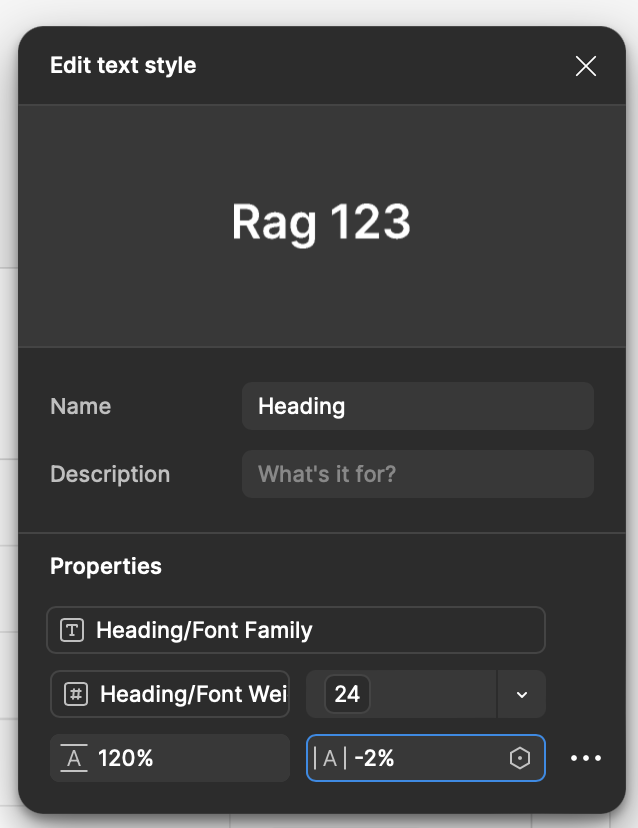
Thought experiment: if I deleted all your letter-spacing tokens overnight, how long would it take for someone to notice? Look, even Figma’s Simple Design System conveniently fails to mention their -2% letter-spacing.
A quick primer on typography tokens
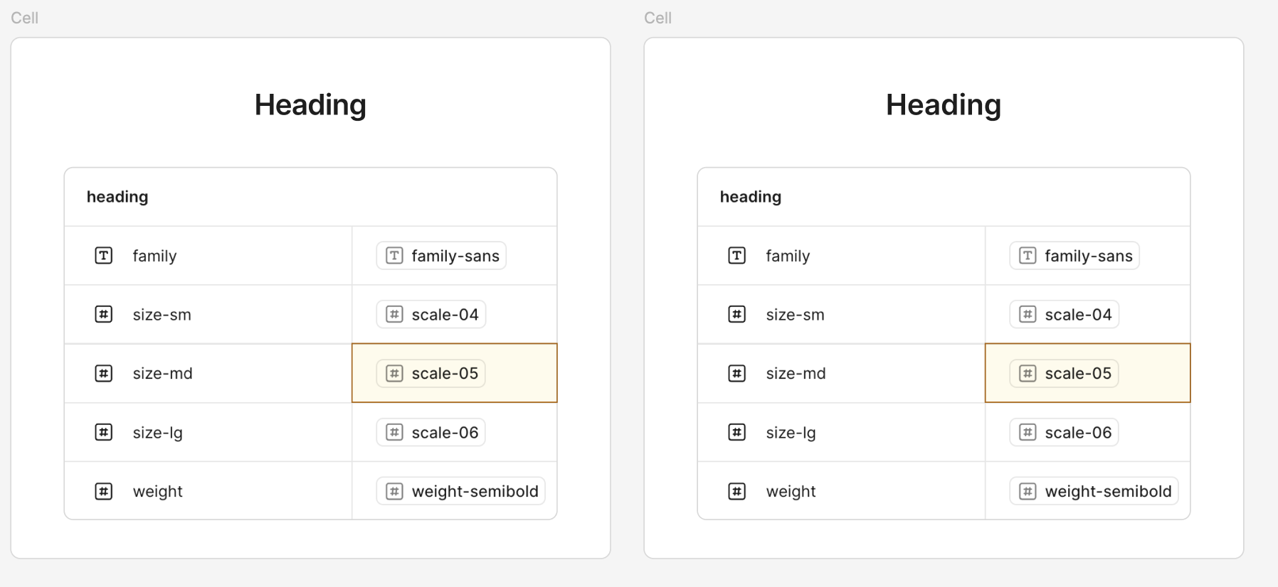
Typography tokens are usually composite tokens, meaning they’re composed of other tokens. They’re the weirdest of the bunch. The design decision for “Heading” styles is composed of a number of little decisions like:
- Font Size
- Font Family
- Font Weight
- Line Height
- and…last and definitely least, Letter-spacing.
This usually plays out as something like:
--font-size-lg--font-sans--font-weight-bold--line-height-whatever--letter-spacing.....whatever
In CSS, this becomes:
.heading {
	font-size: var(--font-size-lg);
	font-weight: var(--font-weight-bold);
	line-height: var(--line-height-whatever);
	letter-spacing: var(--letterspacing-whatever);
}
Notice how we need to introduce a new .heading class? Now we’ve left the realm of tokens and into the realm of abstractions. We needed a way to roll up all of these tiny decisions that make up what we say when we talk about “Heading” styles. Maybe engineering calls this class “h1” but design calls it “heading”. Over time, these little divergences make it difficult to communicate across disciplines. Things slip through the cracks.
If only there was a better way…
The Font Shorthand, Beloved Boi
Enter: font. One of the oldest OG CSS properties, often unused. It’s a shorthand property that rolls all1 of those decisions up into a single property.
If you need some dumb interview trivia questions, ask a developer what the order of properties are for
font. I look it up every single time.
The font property is just a shorthand for <font weight> <font size>/<line height> <font-family>, among a few others. Instead of declaring every one of those typography decisions on multiple lines, we can just simply do
.heading {
	font: var(--font-weight-bold) var(--font-size-lg)/var(--line-height-whatever)
		var(--font-sans);
}
or better yet, we can tokenize the entire heading design decision in a single token. Tools like Style Dictionary make this translation trivial.
:root {
	--font-heading: var(--font-weight-bold)
		var(--font-size-lg)/var(--line-height-whatever) var(--font-sans);
}

.heading {
	font: var(--font-heading);
}
So what about letter-spacing?
That’s right, font does not support letter-spacing. So, at best all we can do is:
.heading {
	font: var(--font-heading);
	letter-spacing: var(--letterspacing-whatever);
}
The implications of this can be pretty large. You can no longer just ship design tokens (as CSS custom properties). At the very least, your system will need to accommodate the design decision of “this thing we call Heading is composed of these other things” by shipping utility classes like .heading-1 and .heading-2.
Now you’ve got to think about things like namespacing and naming conflicts, versioning, breaking changes, communicating breaking changes, the cascade, how to make sure people don’t accidentally override the class, how to make sure people can override the class, and documenting all of the above.
You’ll likely need to do all of that for other reasons, but ask yourself, is that letter-spacing really worth it?
The Details Matter
This isn’t an argument to remove letter-spacing so that developers can remove 4 lines of code. It’s only an argument for questioning why a design decision was made. The answer doesn’t matter, just that there is an answer and it was explicit.
“Because its easier in dev” is too often an excuse to not do something. The little details matter, a lot. Letter-spacing is one of those things that, when it’s there you probably don’t realize it, and when it’s not there, you probably don’t realize it but you can tell something is slightly off like forgetting to put a book back on the bookshelf. Letter-spacing is a spice. Use it well. Or don’t. But if you remove it, developers can use a single token for typography.
Footnotes
-
And by all, I mean all the important ones ↩