Web Component Best Practices
Lessons learned after writing Web Components every day for one year.
Writing Web Components is hard. Writing good Web Components is really hard. After spending the last year building out the AstroUXDS Web Components, I’ve learned a hard truth that a really good React/Vue/Angular/FoobarJS component does not make a really good web component. For those who are first jumping into the pool of Web Components, here is the guide that I wish I had one year ago.
NOTE: A lot of this deals mostly in the context of implementing design systems.
Why are you doing this?
The promise and allure of Web Components can be all too tempting. Being able to write and maintain a single code base that can be used across any framework is something that speaks to everybody almost immediately. However, Web Components are not a panacea. They require an entirely new discipline and frame of thinking. A lot of people will tell you Web Components are great: “look at how easy it is to ship a button component, fully encapsulated with your Design System’s styles!” What they don’t tell you is now you have to figure out how to get your button to interact with forms properly or handle accessibility.
When you choose to write a web component, you’re taking on the fully responsibility of having to think through every possible use case and scenario, while simultaneously juggling developer experience, user experience, and maintainability. Be prepared to think through every minute detail. Failure to do so will result in angry users because the Shadow DOM is unforgiving. Often times the developer will have no mechanism to solve the problem themselves.
Remember we are writing custom (HTML) elements. These atoms need to be flexible enough to create the universe.
Anatomy of a Web Component
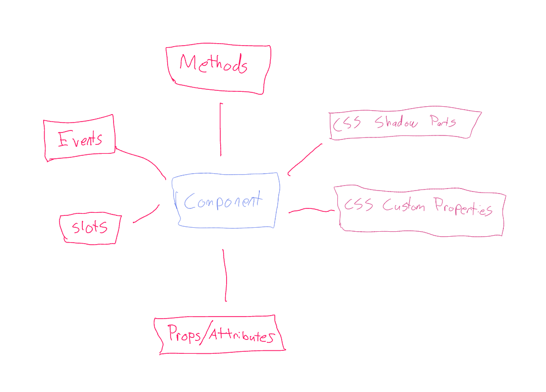
To write a good web component, you need a solid understanding of all of the available APIs at your disposal. You will be constantly juggling between extensibility vs. ease of use. For any given feature, you should think carefully about which API to use.
If you’re coming from a framework mindset, you might already be familiar with slots, props, and events. Web Components give us two additional unique APIs—CSS Custom Properties and CSS Shadow Parts. Your component’s styling is now it’s own API. Use this to your advantage.
Slots
- ✅ Extremely flexible
- ❌ Add complexity to component code
- ❌ Require developers to write more boilerplate
Slots are probably the most powerful API for extendibility because they sit outside Shadow DOM and can contain any custom HTML.
Properties/Attributes
- ✅ Easy to use
- ✅ Familiar to users
- ❌ Not very flexible
Properties and attributes are the most familiar concepts, usually used for controling things like state. However, they are the least flexible when it comes to allowing custom content.
For example:
<my-component content="This is my content!"></my-component>This works great if all you need is to display a basic string. But what if I wanted to pass in my own HTML? Maybe I want to throw in an svg icon or a whole form. I can’t fit all of that in as just a string. This component wouldn’t be very useful to me.
Methods
- ✅ Provide unique functionality
- ❌ Require JavaScript
Public methods are great if your component has some kind of action that it can perform. A good example would be a typical Modal component that might have show() and hide() methods. Simply using an open prop in this case might not be enough for a developer looking to do something after the modal has been opened because it may not be available yet. Instead, they would need to use the modal’s show() method which could return a promise that would resolve once it has finished opening.
CSS Custom Properties
- ✅ Flexible
- ❌ Bad DX if used carelessly
CSS Custom Properties are one of two ways for allowing developers to pierce the Shadow DOM. Remember doing my-button { background: red; } won’t do anything because of Shadow DOM encapsulation. But if you used a CSS Custom Property to control your background color, developers could do something like --button-bg-color: red;.
In the early days, CSS Custom Properties were the only way for developers to customize the styling of a Web Component. This lead to a lot of early adopters adding an absurd amount of CSS Custom Properties. --button-border-radius, --button-text-color, --button-font-family, etc, etc. Custom Properties for nearly every imaginable CSS property. It was a hot mess. Luckily we got a better way—CSS Shadow Parts.
But CSS Custom Properties still have their place:
CSS variables are scoped to the host element and can be reused throughout the component. A good example of a CSS variable would be
--border-width, which might get reused throughout a component to ensure borders share the same width for all internal elements. - Shoelace - When To Use a CSS Custom Property
CSS Shadow Parts
- ✅ Extremely flexible
- ❌ Maintainability can suffer if used carelessly
- ❌ Require developers to write more boilerplate
CSS Shadow Parts solve the problem of “how do I style XYZ”. They allow you to define the “parts” that your custom element is composed of. Channel your inner Zeldman. Shadow parts should have some semantic meaning. They should represent an abstract piece of your component. Because these are part of your API, you need to be careful in what you expose publicly.
Sometimes the answer to “how do I style XYZ” is, “you don’t”. Maybe you don’t want the background color to be allowed to be anything. Instead, you might expose a property that can only accept a few whitelisted options.
- Part names should be consistent across all components wherever possible.
- Shadow parts cannot be nested.
- Shadow parts can only be single elements.
my-componet::part(base) > svg { display: none; }won’t work.
Avoid making every element a part if possible. Once an element is a shadow part, it will require a breaking change to alter the markup later. See when to create CSS parts for much greater detail.
If your component is small enough (atom level), you may end up with every element having its own shadow part and that is totally okay.
The Right Tool
Now let’s take a very simple feature—we need to write a button component that can show two different variants: primary and secondary. How might we implement this?
With Props
<my-button type="primary"></my-button> <my-button type="secondary"></my-button>With a Method
const el = document.querySelector('my-button') el.setType('primary') el.setType('secondary')With CSS Custom Properties
my-button {
  --button-background-color: var(--color-primary);
  --button-border-color: var(--color-primary);
  --button-text-color: var(--color-text);
  // + all hover, active, focus states sheesh
}
With CSS Shadow Parts
my-button::part(container) {
  background-color: var(--color-primary);
  border-color: var(--color-primary);
  // etc etc
}
Here are four different ways we can expose a given feature. A prop is clearly the winner in terms of ease of use. But now imagine what if we wanted to allow more than just two colors? What if we wanted to allow any color, as long as it is defined in the design system? We would need to add another 30+ prop options.
The point is there is no single best answer for which API to use when. It’s a matter of deciding what you want to allow and what the best DX would be.
Opinionated Best Practices
1 . Be Declarative - Avoid arrays and object attributes
Remember we are writing custom HTML elements. Our components must be usable in the browser, without a framework, without JavaScript. Think of this use case as your lowest common denominator. My personal litmus test: “would a teenager be able to use this element on their MySpace page?”
So let’s consider a basic List component. Your first pass might look something like:
<my-list
  data="
    [
      {
        id: 1,
        text: "Item 1"
      },
      {
        id: 2,
        text: "Item 2"
      }
      ...
    ]
  "
>
</my-list>
This works nicely if you’re using a js framework to do the heavy lifting for your data binding. But if you’re using plain HTML, you’re now forced to write some javascript:
const data = [...]
const el = document.querySelector('my-list')
el.data = data
Now what if you wanted the list items to be links? Or include an icon? What if you wanted every third item to open a modal and every tenth item to navigate to a page?
Back to the drawing board.
<my-list>
  <my-list-item>Item 1</my-list-item>
  <my-list-item> <my-icon /> Item 2 </my-list-item>
</my-list>
By creating a new my-list-item component, suddenly we are much more flexible and can avoid the unending series of ‘what if’ questions.
If you must use arrays or objects, make sure to accept them only as properties and do not reflect them as attributes for performance reasons.
In the words of Kent C Dodds, avoid soul crushing components.
2. Don‘t style attributes
<my-component open></my-component>my-component {
display: none;
}
my-component[open] {
display: block;
}For this example to work, you need to be extra careful that you are reflecting your open attribute correctly. If someone were to change the open property and you forget to reflect it to the attribute, your component will break and this can be very difficult to debug.
Instead, use internal classes and style those.
3. styles are sacred
Be careful when styling
. Anything you put here will NOT be shadow dom encapsulated and thus, can be changed by the developers using your component. styles are generally best for default properties likedisplay .
4. (Try to) fail silently
Does <select> throw an error if you try and pass in an <h2> as a child? No. HTML fails silently. We should also treat the console as sacred as well and do our best job not to pollute it with unnecessary warnings and errors.
Throw errors only when you absolutely cannot continue. If you’re throwing an error, take a second to pause and consider why and make sure that you have a good reason. Sometimes they are unavoidable though.
On AstroUXDS, we generally like to reserve warnings for deprecating warnings only. But this is just an opinionated stye decision.
5. Data Flow - Props Down, Events Up
The traditional wisdom around data flow remains the same. Props down, events up. Lift state up. Whatever you want to call it. If two sibling components need to talk to each other, they probably need a parent mediator component.
6. Steal Code. (I’m not a lawyer)
Seriously. The web today is the result of a generation right-clicking “view source” and “assimilating” what others have done. That’s how we got to where we are now. That’s why the web is the most democratizing platform. The idea of sharing and openness is baked right in to your browser. If you don’t personally have an anecdote about trying to create a website for your band in middle school by copy and pasting some piecemeal HTML you’ found somewhere, I guarantee you probably know at least one person who does.
So stand on the shoulder of giants and don’t reinvent the wheel and all those other cliches. When you encounter a problem, go look at how other people have solved it. Pick the one you like the most. (Forms, for example, were a fun one).
Some of the best resources that I’ve found are:
- Shoelace - Quite possibly the gold standard of web component libraries. A lot of these best practices have been adapted from Shoelace’s own Best Practices. I encourage you to read this in full multiple times. My entire foundation of what makes a great web component has come from reading through Shoelace’s source.
- Ionic - One of the very few early adopters and champions for web components. Completely battle-tested. The amount of eyes they have on their components is insane. Superior DX and a perfect case study on how web components can serve developers of all frameworks.
- Spectrum Web ComponentsAdobe’s Design System, web component flavored.
- OpenUI Not a library but one of the most valuable resources when designing a net new component. My go to for inspiration on the mundane task of what to actually name things, what are the expected props, etc.
- MDN - For inspiration, return to the classics. If you’re building a custom element that already exists, it’s generally a good idea to default to the behavior of the native element. Building web components gave me a new appreciation for HTML.
Tip: in Chrome Dev Tools, you can turn on ‘show user agent shadow dom’ to see the shadow dom of all your favorite classic elements.
- Web.dev’s Custom Element Best Practices - Another great general list of best practices.