Where are all the read-only radio buttons?
Why aren't read-only radio buttons more common?
I start this adventure with a question and a seed of doubt: “Why are read-only radio controls so uncommon in design systems?” What even is read-only? When do I use it? Can’t I just use disabled? Could HTML be flawed or am I just bad at my job?
At the end of this, I don’t have any definitive answers other than “it depends and this is what I landed on”. Accessibility is insanely hard. I am not an expert. If anything in here appears factually incorrect, please reach out and tell me: accessibility@cianfrani.me
The Setup
Consider these product requirements:
- You have a multi-step form. You have an assortment of controls: text inputs, radio buttons, custom radio “cards”, checkboxes, and select menus, but radios are predominately more common.
- After a user submits a question, they cannot edit their response.
- A user can go backwards and forwards and should be able to view their response.
- Prefer native HTML wherever possible. Write as little javascript as humanly possible.
As a designer—you need some way to communicate that a field cannot be interacted with.
As a developer—you need some way to prevent the field from being interacted with.
The easy way—“just slap a disabled attribute on it! Our design system even gives this nice little grey-washed visual to us for free.”
Not quite. For keyboard-only users, disabled is the most scorched-earth approach you can take. The element is no longer editable because it no longer exists as far as they’re concerned. Disabled elements lose their tabindex, therefore they cannot be returned to after submitting the form. While some screen readers may still be able to navigate and announce disabled form controls, they won’t be able to use Tab to navigate.
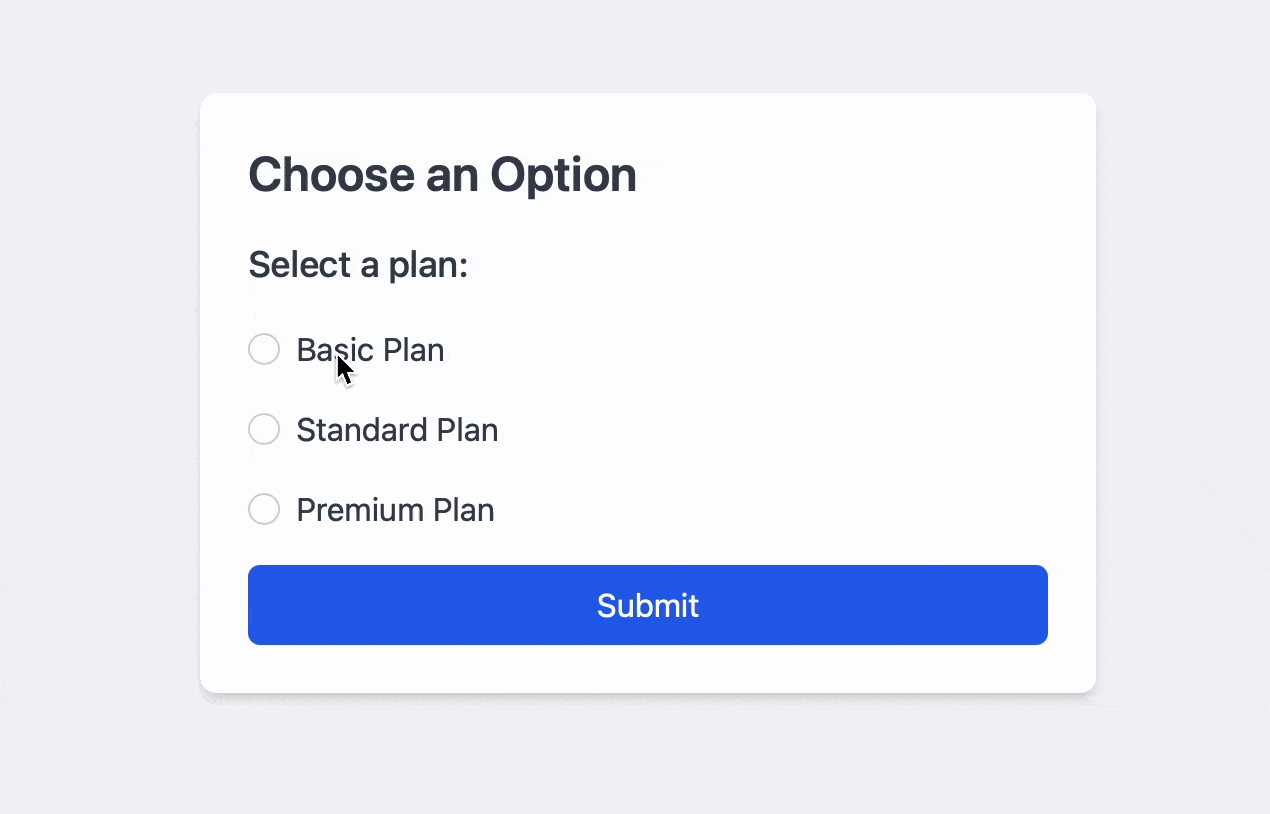
In this example, I expect to be able to return focus to the radios using only the keyboard:
As part of the requirements, a user must be able to view previously-submitted responses and they must be able to navigate through them using Tab. In other words, the radio controls cannot be edited, but they still need to be focusable.
So, how can we implement this in the most accessible way?
If we can’t use the disabled state, is there anything else? What about that read-only thing?
What only?
“Read-only” is a weird, often-forgotten state. It’s sometimes seen next to the disabled state, if at all. Visually, it can share similar visual style (though it really should have it’s own unique visual style). A form control is considered to be in a read-only state when it is present, but the user cannot edit the value. Unlike disabled, read-only components are still focusable.
Implementation
The Boolean readonly attribute, when present, makes the element not mutable, meaning the user can not edit the control.
<label for="name">Name:</label> <input id="name" type="text" readonly />So I can just slap a readonly attribute on my input and that’s it?
Not quite. This is where things get fun.
For text inputs, sure this works.
For basically everything else, like radios:
<fieldset readonly>
  <legend>Select your starting hero</legend>
  <input type="radio" name="hero" id="beren" value="beren" />
  <label for="beren">Beren - The mortal who braved Morgoth's halls</label>
  <input type="radio" name="hero" id="eol" value="eol" />
  <label for="eol">Eöl - The Dark Elf, smith of Nan Elmoth</label>
  <input type="radio" name="hero" id="haleth" value="haleth" />
  <label for="haleth">Haleth - Leader of the Haladin, unyielding in the wild</label>
</fieldset>
Wrong.
According to MDN:
Note: Only text controls can be made read-only, since for other controls (such as checkboxes and buttons) there is no useful distinction between being read-only and being disabled, so the
readonlyattribute does not apply.
This doesn’t work nor is it valid, but it’s more or less the API that we want. Semantically, we want a read-only state.
Why does read-only only apply to text inputs?
What does that mean? “no useful distinction between being read-only and being disabled” Given our requirements, there’s absolutely a useful distinction between being read-only and disabled. We want to preserve the tab order. If I previously checked Beren, I want to know that.
Let’s peel back the onion another layer.
For this to make sense, we need to talk about two different concepts—value and checkedness.
Most form controls have a value and a checkedness…These are used to describe how the user interacts with the control.
<input id="annoying-guilt-disclosure" type="checkbox" value="signup" />
<label for="annoying-guilt-disclosure"
  >Sign up to the mailing list unless you hate free money.</label
>
A checkbox can have a value of “Sign up to the mailing list unless you hate free money”. If I click it, the value stays the same—it’s checkedness is what changes, whether its checked or unchecked. Same goes for radios. For text, checkedness doesn’t apply and it’s always false.
So by that definition, the value of a checkbox or radio doesn’t change. That’s my only guess as to why read-only doesn’t apply.
The story so far
A blanket approach of disabled or readonly won’t work. Radio buttons seem to be the most problematic so we’ll focus on just these specifically. Are there any aria-attributes we could consider?
aria-readonly
There’s aria-readonly, but support seems iffy at best and also:
It does not belong on native HTML elements, but if used then the browser should override it by the native
readonlyattribute. It is meant for non-native implementations of the rolescheckbox,combobox,grid,gridcell,listbox,radiogroup,slider,spinbutton, andtextbox.
If radio inputs don’t support readonly, they also don’t support aria-readonly.
aria-disabled
Next, there’s aria-disabled
Indicates that the element is perceivable but disabled, so it is not editable or otherwise operable. See related
aria-hiddenandaria-readonly.
That sounds exactly like what we want.
But wait, MDN says:
the aria-disabled=“true” only semantically exposes these elements as being disabled. Web developers must manually ensure such elements have their functionality suppressed when exposed to the disabled state.
We keep our tab index, but we lose the interaction prevention.
It seems like we’re playing a game of whack-a-mole here. Let’s recap our four options:
Disabled v Readonly v Aria-disabled v Aria-readonly
| Feature | disabled | readonly | aria-disabled | aria-readonly |
|---|---|---|---|---|
| Purpose | When present, makes the element not mutable, focusable, or even submitted with the form. | When present, makes the element not mutable, meaning the user can not edit the control. | Indicates that the element is perceivable but disabled, so it is not editable or otherwise operable. | Indicates that the element is not editable, but is otherwise operable. |
| Applicability | Form controls like <input>, <button>, <select>, <textarea>, <fieldset>, <optgroup>, <option> | Text, search, telephone,email, password, date/month/week/time, local date and time, number, input fields | used in roles: - application- button- composite- gridcell- group- input- link- menuitem- scrollbar- separator- tab | - checkbox- combobox- grid- gridcell- listbox- radiogroup- slider- spinbutton- textbox |
| Focusability | Element is not focusable. | Element remains focusable. | Element remains focusable. | Element remains focusable. |
| Interaction Prevention | Automatically prevents all user interactions. | Prevents content modification but allows text selection and focus. | Requires additional scripting to prevent user interactions fully. | Prevents content modification but allows text selection. |
| Announced by Screen Readers | Some screen readers announce the element as “disabled.” | Some screen readers announce the element as “read-only.” | Some screen readers announce the element as “disabled.” | Some screen readers announce the element as “read-only.” |
| Impact on Tab Order | Removed from the tab order; users cannot navigate to it via keyboard. | Remains in the tab order. | Remains in the tab order. | Remains in the tab order. |
Looking at disabled again, the biggest issue is mostly it’s impact on tab order. If our forms only have a few checkboxes or radios, simply using disabled and carefully, surgically, manually managing tab index might be a valid, cost-effective option.
I wanted something more generic and reusable. The next best option is aria-disabled. While it doesn’t prevent interaction, it does handle the much harder accessibility problems instead. Ignoring the visual style for now, the only thing I’ll need to provide is manually preventing interaction.
Going back to my ideal API, before I knew anything about how messed up the web is, I need a way to mark a single field or fieldset as “read only”. This should do a few things under the hood:
- Set
aria-disabledto true - It should prevent click.
- It should listen on keydown, on space it should prevent so that you can’t select with keyboard.
At the design system level, we can apply styles directly on the aria attribute and make use of CSS’s native nesting. The result is a radiogroup that truly read-only.
Some Code
I’m on an Angular kick lately and so the concept of directives is very appealing to me for stuff like this. Here’s what a quick implementation in vanilla js might look like, but you can easily adapt it to whatever framework you’re using.
  <script>
    class ReadonlyRadioDirective {
      constructor(fieldset, isReadonly = false) {
        this.fieldset = fieldset;
        this.isReadonly = isReadonly;
        this.radioInputs = this.fieldset.querySelectorAll('input[type="radio"]');
        this.init();
      }

      init() {
        this.updateAriaStates();

        // Block clicks & space presses
        this.fieldset.addEventListener('click', this.onClick.bind(this), true);
        this.fieldset.addEventListener('keydown', this.onKeydown.bind(this), true);
      }

      updateAriaStates() {
        // Set or remove aria-disabled at the fieldset level
        this.fieldset.setAttribute('aria-disabled', this.isReadonly ? 'true' : 'false');

        // Optionally label the group so screen readers know it's read-only
        // This assumes there will be some `readonly-help` content on the page.
        // Yet another rabbit hole: aria-labelledby or aria-describedby?
        if (this.isReadonly) {
          this.fieldset.setAttribute('aria-labelledby', 'readonly-help');
        } else {
          this.fieldset.removeAttribute('aria-labelledby');
        }

        // Also set aria-disabled on each radio just to be safe.
        // Whether or not just setting aria-disabled on the fieldset
        // is enough vs. setting on each control is yet other
        // rabbit hole
        this.radioInputs.forEach(radio => {
          if (this.isReadonly) {
            radio.setAttribute('aria-disabled', 'true');
          } else {
            radio.removeAttribute('aria-disabled');
          }
        });
      }

      onClick(event) {
        if (this.isReadonly) {
          event.preventDefault();
          event.stopPropagation();
        }
      }

      onKeydown(event) {
        if (this.isReadonly && event.key === ' ') {
          event.preventDefault();
          event.stopPropagation();
        }
      }

      setReadonly(value) {
        this.isReadonly = Boolean(value);
        this.updateAriaStates();
      }
    }

    // Example usage:
    // const fieldset = document.querySelector('fieldset');
    // const directive = new ReadonlyRadioDirective(fieldset, false);

    // Later, lock/unlock it:
    // directive.setReadonly(true);
    // directive.setReadonly(false);
  </script>
/**
* [!GEN AI WARNING]: These styles were mostly written by generative AI because I'm lazy.
* and because they're not important. The only important piece is the decision to style
* aria-attributes.
*/
:root {
--color-gray-300: #d1d5db;
--color-gray-500: #6b7280;
--color-gray-100: #f9fafb;
--color-blue-500: #3b82f6;
--color-blue-500-rgb: 59, 130, 246;
--color-gray-500-rgb: 107, 114, 128;
--focus-ring-opacity: 0.5;
--checked-ring-opacity: 0.3;
}
input[type="radio"] {
appearance: none;
width: 1.25rem;
height: 1.25rem;
border: 2px solid var(--color-gray-300);
border-radius: 50%;
outline: none;
cursor: pointer;
&:focus {
box-shadow: 0 0 0 3px rgba(var(--color-blue-500-rgb), var(--focus-ring-opacity));
}
&:checked {
border-color: var(--color-blue-500);
background-color: var(--color-blue-500);
box-shadow: 0 0 0 3px rgba(var(--color-blue-500-rgb), var(--checked-ring-opacity));
}
&:hover:not(:disabled) {
border-color: var(--color-blue-500);
}
}
/* Disabled styles using aria-disabled */
fieldset[aria-disabled="true"] {
opacity: 0.5;
cursor: not-allowed;
input[type="radio"] {
cursor: not-allowed;
&:not(:checked) {
border-color: var(--color-gray-300);
background-color: var(--color-gray-100);
}
&:checked {
border-color: var(--color-gray-500);
background-color: var(--color-gray-500);
}
/* Checked + Focused + Disabled */
&:checked:focus {
box-shadow: 0 0 0 3px rgba(var(--color-gray-500-rgb), var(--checked-ring-opacity));
}
}
}On Design Systems
And this is where design systems come in. If your system only has options for a disabled state, you’re more or less stuck with that as your only option. You can put in a ticket or feature request, but (depending on your governance model), there’s no guarantee it gets addressed in time, if at all.
And since it’s at the system level, *all** form controls will need a read-only state, not just radios. More detective work is needed. More tests. More maintenance.
It’s easy to fall into the trap of “just use the design system”. In this case, had I just used disabled, the end result is a very poor accessibility story and the design system ends up causing more harm than good.
I’m not arguing against design systems though. This is just one example that goes to show just how important they are and how complicated they can be. They’re the thoughtful dinner host. Getting this stuff right is hard. It takes an enormous amount of time. Testing takes even longer. There is often no definitive answers. Today’s LLMs were trained on all the wrong things and can’t help us here.
Prior Art
Both Salt and Spectrum explicitly offer read-only states for radio buttons.
I like Salt in particular because it tells me why it exists immediately:
Use a read-only radio button instead of a disabled radio button when the text description contains information valuable to the user.
The best design systems will reinforce best practices and give the consumer the confidence that they’re picking the right thing. Whether that’s the right component, or token, or in this case, state, …and without being too prescriptive to the point of doing product work.
Where have all the read-only radios gone?
At the end of the day, there aren’t that many examples of read-only radio buttons out there. The HTML spec flat out doesn’t support it. Why is this problem so complicated? Is this actually a problem?
I suspect it’s just not a problem for most people and that’s why I never paid much attention to it. My optimistic answer is that it’s not a problem because the original requirements are too specific or that there’s a completely unknown 5th option. My pessimistic answer is that it’s not a problem because focusability was never considered to be an original requirement.